
Project Overview
Branding project for a small food start-up,
Skills
- Brand Identity
- Logo Design
- Web Design
- Motion Graphics
- Social Media Content
About Bloom
Bloom Donuts are a small start-up brand. They are entering the market with a unique selling point of having exciting new and exotic donut flavours.
Design Process
This project strategically followed the design process starting with research to clearly outline target markets, brand goals, visions and wording. This stage involved analysing competitors and reviewing initial colour palettes and brand patterns to create a foundation for the design.

Colour Palette
To demonstrate pop and excitement bold colours were chosen with high contrast. The colours closely resemble that of a doughnut. It was important for the business to clearly show the product they are selling on first look.
HEX: #e059e3
CMYK: 38 69 0 0
RGB: 224 89 227
HEX: #ffd159
CMYK: 0 19 72 0
RGB: 225 205 89
HEX: #ffffff
CMYK: 0 0 0 0
RGB: 225 225 225
Typography
Giulia Bold
Lorem ipsum dolor sit amet. Aut quas placeat in quae excepturi qui consequuntur ratione a praesentium iure est doloremque dolorem. Et dicta deleniti et quia atque cum natus earum et sint consequatur. Et tempore maiores ut similique numquam aut doloremque laudantium a explicabo explicabo et nobis eveniet.
Header's use this font. The thick stroke is designed to give a feeling of satisfaction and full similar to the emotional feeling of eating a doughnut. The shape if the font has soft edges and droopy tails similar to the shape and texture of a doughnut
Helvetica Regular
Lorem ipsum dolor sit amet. Aut quas placeat in quae excepturi qui consequuntur ratione a praesentium iure est doloremque dolorem. Et dicta deleniti et quia atque cum natus earum et sint consequatur. Et tempore maiores ut similique numquam aut doloremque laudantium a explicabo explicabo et nobis eveniet.
All other text uses this - A modern, simple and clear font.
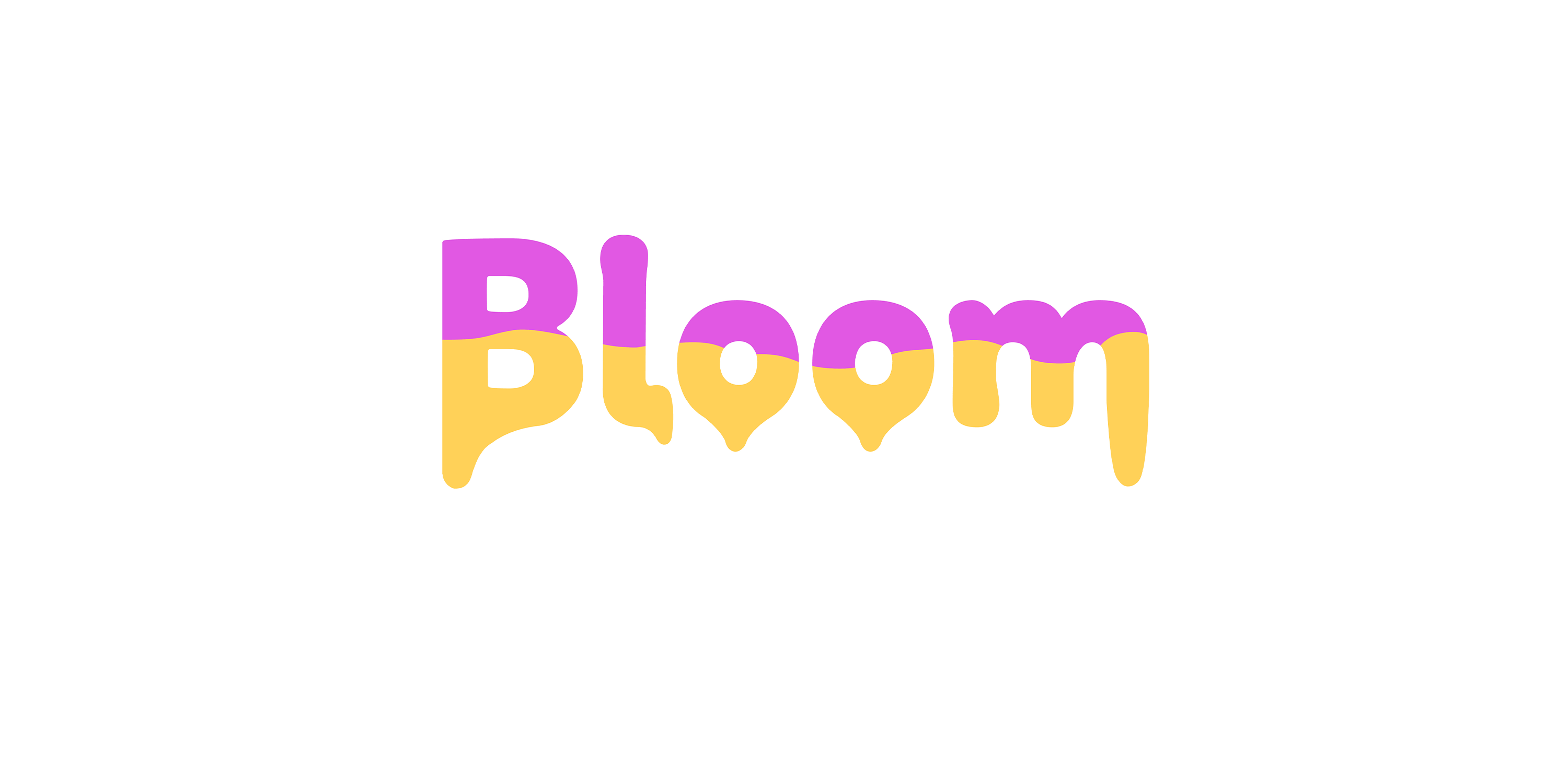
Logo Design
The logo incorporates the primary font above with alterations to the design. A clear split pattern along the middle of the logo reflects the design of a doughnut and icing with the letters drooping down at the base of the logo to insinuate 'mouth watering'. The style is simple, reflective of the product and bold to engage customers. The logo can be used as a motion graphic as seen below for marketing and social media purposes.
Brand Pattern
Below is an example of a brand pattern to be used similarly in all graphic material to ensure brand consistency throughout work.

Marketing Material
I designed marketing material such as billboards, packaging, posters, menus and company assets. This required knowledge of print processes, colours and layouts.


Social Media Content
Social media posts focus on the brand launch adhering to brand patterns and guidelines. The social media promoted marketing strategies such as initial 'buy one get one free' to build engagement and 'sneak peaks' to create suspense and excitement.


